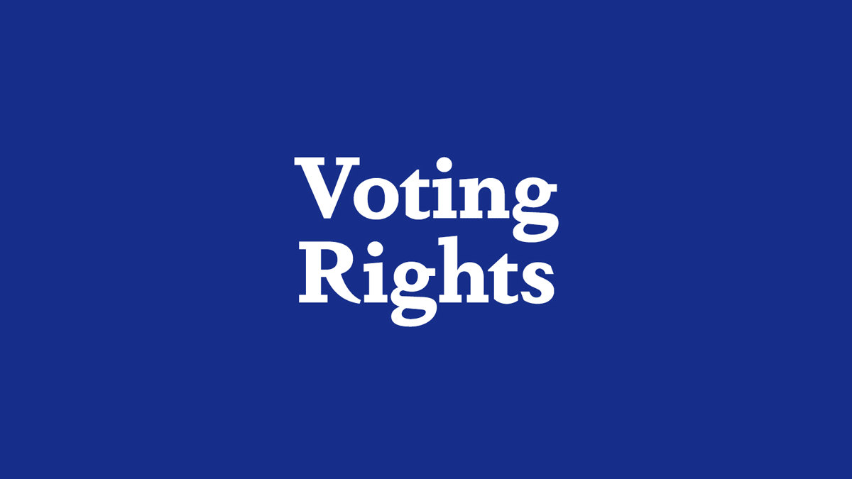
Voting Rights and Fitness under One Roof
Not traditionally paired together, these two subjects were the focus of a recent design project.
I developed a brand identity and website redesign for Spenser Mestel, my favorite journalist, and he covers Voting Rights and Fitness. It was a good client-designer match, considering we go to the same gym, and as those of you who follow this blog know, I’m passionate about protecting election integrity.
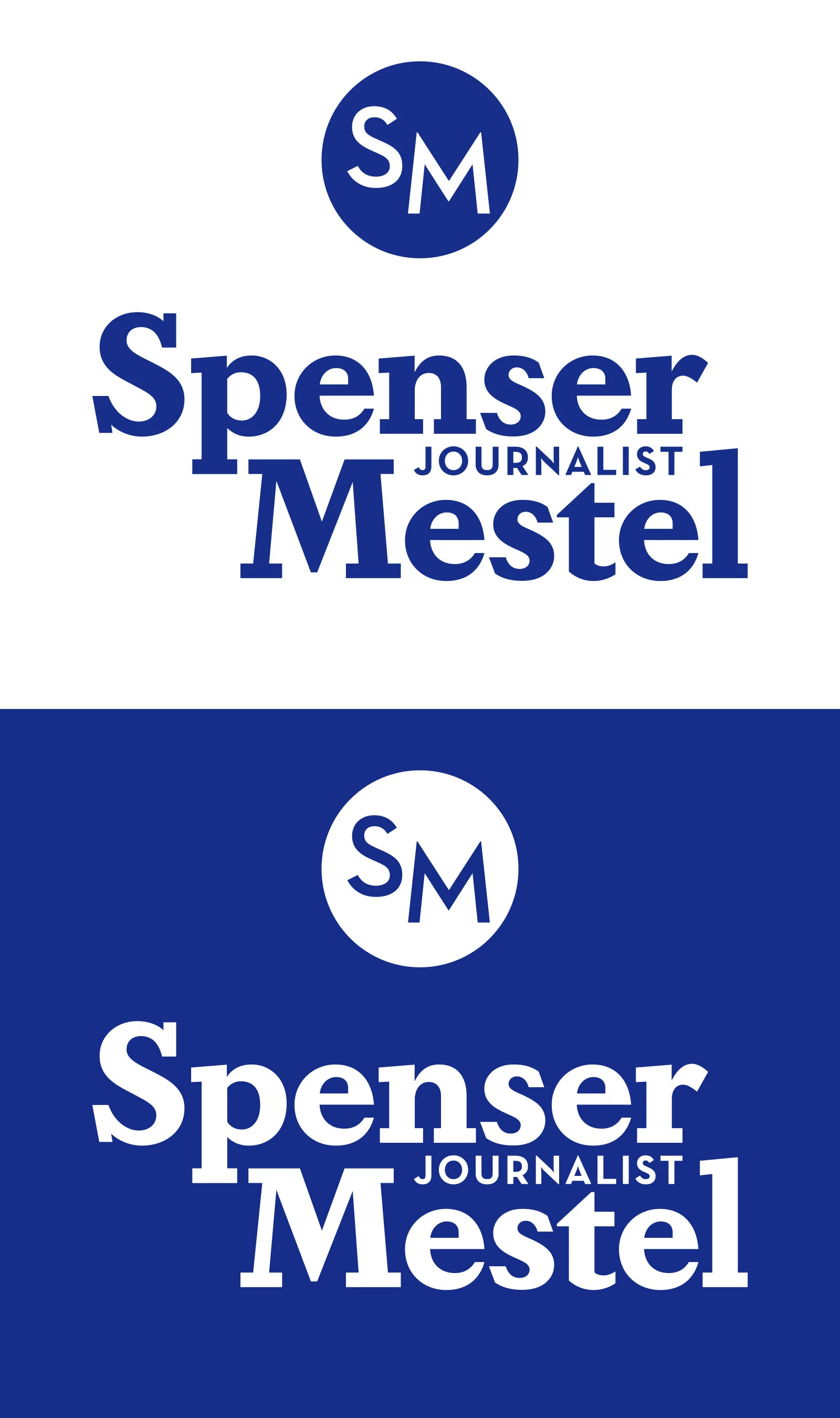
Since I’m personally familiar with the initials SM, creating a monogram was a necessary feature.
The design brief: completely overhaul Spenser’s former website to welcome readers and writers interested in either topic. So, Voting Rights and Fitness needed to be clearly separated but still coexist in the same place. Plus, because Spenser would need to consistently update it, the site had to be easy to use.

Color and typography were the first considerations. Blue was the obvious choice for its sportiness and prominence in election graphics, but it needed to be distinctive in a field of iconic blues. I like to think my choice, Spenser Blue, holds the same prestige as Hermès orange and Coca-Cola red, so we’re prepared when he reaches our Pulitzer-winning expectations. Design tip: flattery is often a great way to get positive buy-in from your clients.
Next, the typography took its inspiration from editorial design codes: a bold slab-serif that conveyed urgency, importance and credibility. We chose Dapifer, a font with similarities to NYT Karnak, used in the paper’s “Truth is Hard” campaign. To further distinguish his brand, we paired it with a modern sans serif.
The final design challenge was Spenser’s other writing project: Spenser’s Super Tuesday, a weekly newsletter devoted to under-reported topics in the fight for voting rights. To visually represent it, we carried his font and typography branding into fun riffs on traditional voter stickers.

As for the monogram, it’s a simple solution that combines all the elements together. If a picture can be worth a thousand words, a thoughtfully designed animated GIF can summarize a design concept (and give Spenser more ways to promote his site):
For the website redesign, we treated it as a branding platform to show what makes Spenser stand out as a journalist. His previous site was a utilitarian deposit of his article links, but we wanted to tell a larger story with the redesign. This approach not only looked better, but it also gave context as to why this site gives equal weight to two unrelated topics. As for the hosting platform, we went with Squarespace for its intuitive approach to adding and rearranging articles. Spenser’s greatest strength is his writing – and his ability to do a pistol overhead squat balanced on top of a kettlebell, which doesn’t need a full website redesign – and the design intent was to make his words do the heavy lifting.

