Holiday Design Tip
“When it comes to designing for the holidays, take the most recognizable element of a brand and fuck it up as much as possible.”
— Simon Doonan, legendary window dresser, creative director of Barneys, and head elf in charge of Michelle Obama’s White House Christmas decorations.
At the time I heard this advice, I was working for his husband, Jonathan Adler, designing holiday shopping bags for the company. My initial attempts were fairly generic and boring (I’m sure one design was the logo with a Christmas ornament replacing the letter “o”), and Adler told me to send them to Simon for a second opinion. It was the most influential design advice I’ve ever received.
When approaching holiday branding, it’s easy to throw a pair of reindeer ears or snowflakes onto a design. But nothing about that pays tribute to the company you’re designing for. Because our company had a groovy spirit and festive energy in its store, I decided to incorporate that into the holiday bags. Not every brand would be okay with this “defacement,” but it’s a useful principle for your yearly yuletide re-designs.

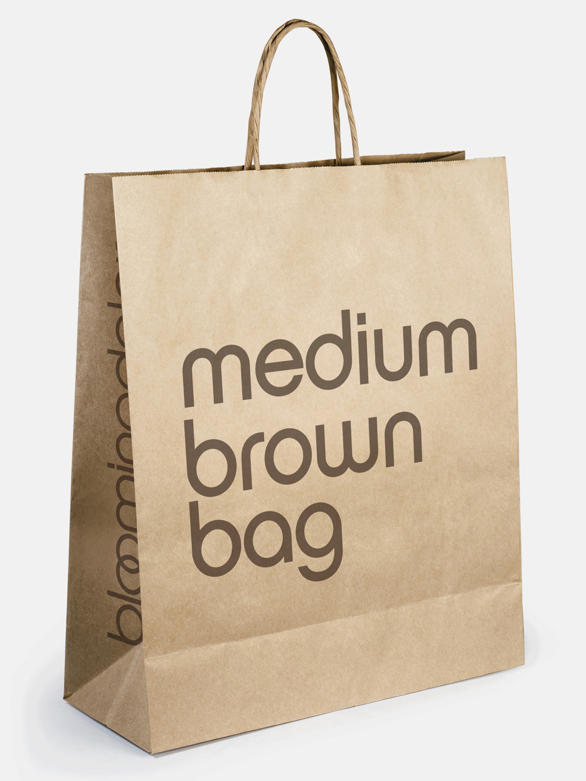
I was thinking of Simon’s advice a few years later designing for Bloomingdale’s. Is there any shopping bag as iconic as the Big Brown Bag? So, I knew I had to pay homage to their original design while also “fucking up” the brand as much as possible.